



Reward Machine




Project
Reward Machine (FanDuel)
Role
Lead Product & Motion Designer
Team
Product · Engineering · Creative
Scope
Product Strategy · UX/UI · Interaction · Motion · Prototyping
Overview
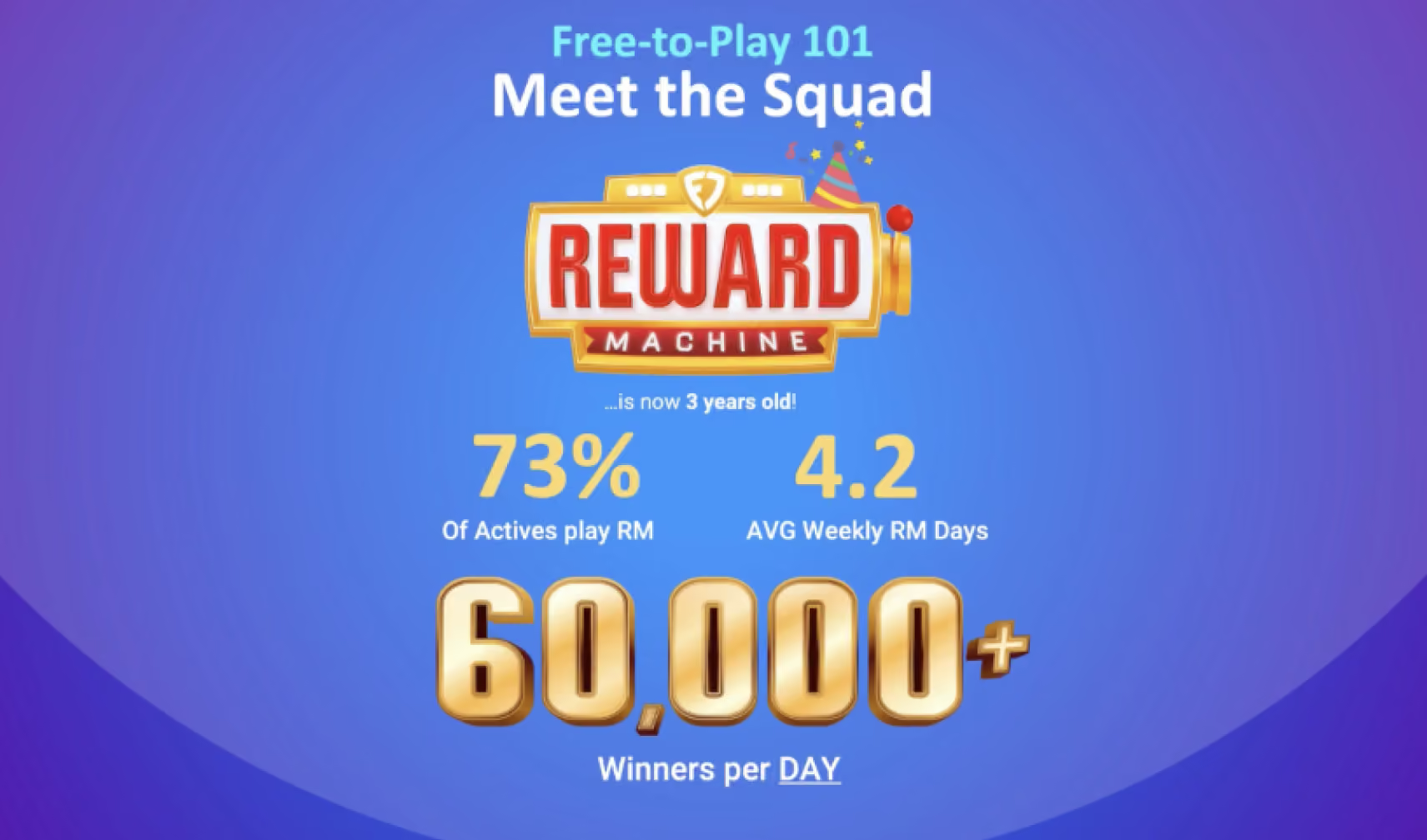
Reward Machine was already a high-traffic experience within FanDuel Casino, but it existed somewhat independently from the broader Rewards Club journey. I saw an opportunity to turn an existing player habit into a more meaningful expression of loyalty.
As the lead designer, I reimagined the experience around progression, personalization, and engagement, connecting Reward Machine to each player's Rewards Club tier while creating a visual and interaction system that could scale across the ecosystem.
The result was a more personalized experience that made loyalty visible throughout gameplay and gave players stronger reasons to return.
The Opportunity
Reward Machine had an established mechanic and strong player engagement, but there was an opportunity to make the experience work harder for both the player and the broader loyalty strategy.
The challenge became:
How might we turn a familiar, high-frequency interaction into a meaningful loyalty experience that reinforces progression and gives players a reason to keep coming back?
I focused on three areas:
Connect Reward Machine to Rewards Club
Make loyalty feel like part of the experience rather than something that exists elsewhere in the product.
Make progression more visible
Help players understand their status, collection progress, and rewards at a glance.
Create a system that could scale
Build a flexible visual, interaction, and motion system that could support multiple loyalty tiers and future campaigns.
Reimagining a Familiar Experience
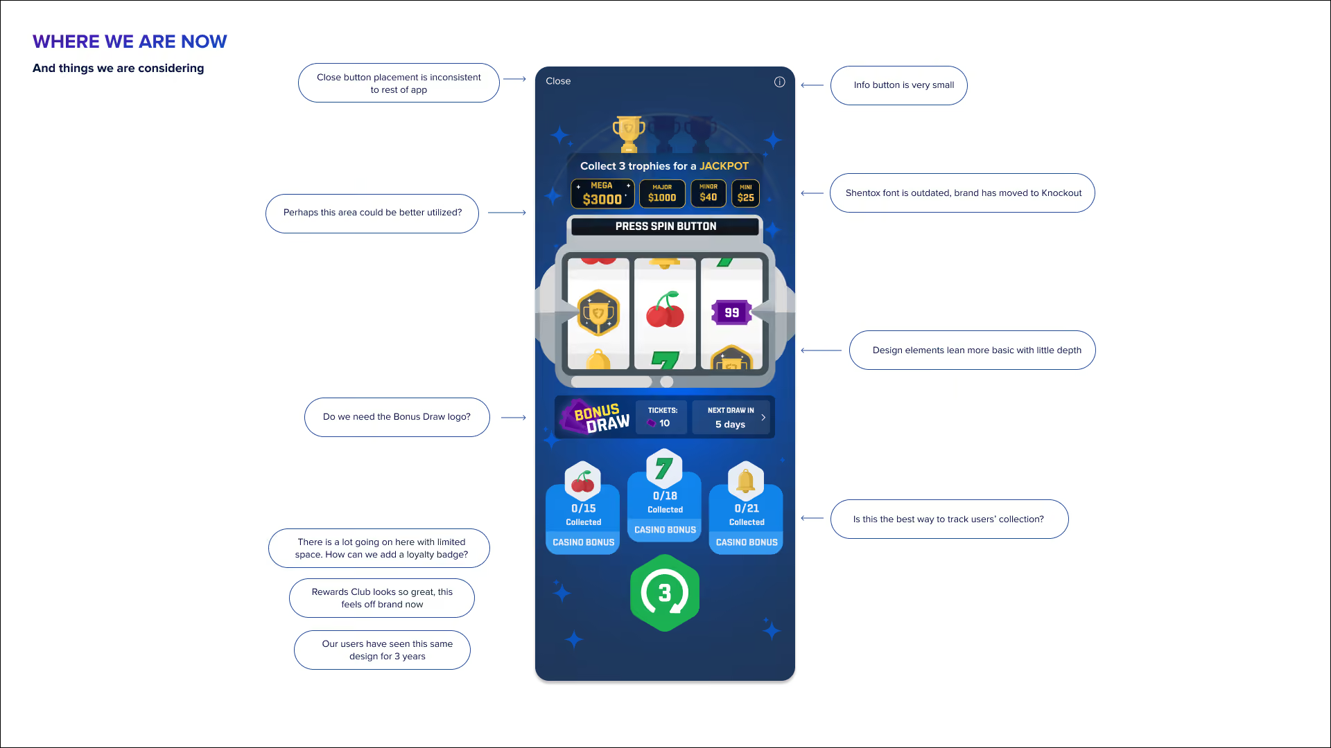
Before designing anything new, we stepped back to understand what was working—and where the experience had room to evolve. Our audit surfaced three key questions:
How could we make collecting icons easier to understand?
How could loyalty become a more meaningful part of the experience?
And after three years of familiarity, how do we redesign the Reward Machine without losing what users already know and love?
These questions became the foundation for our design exploration.
Discovery
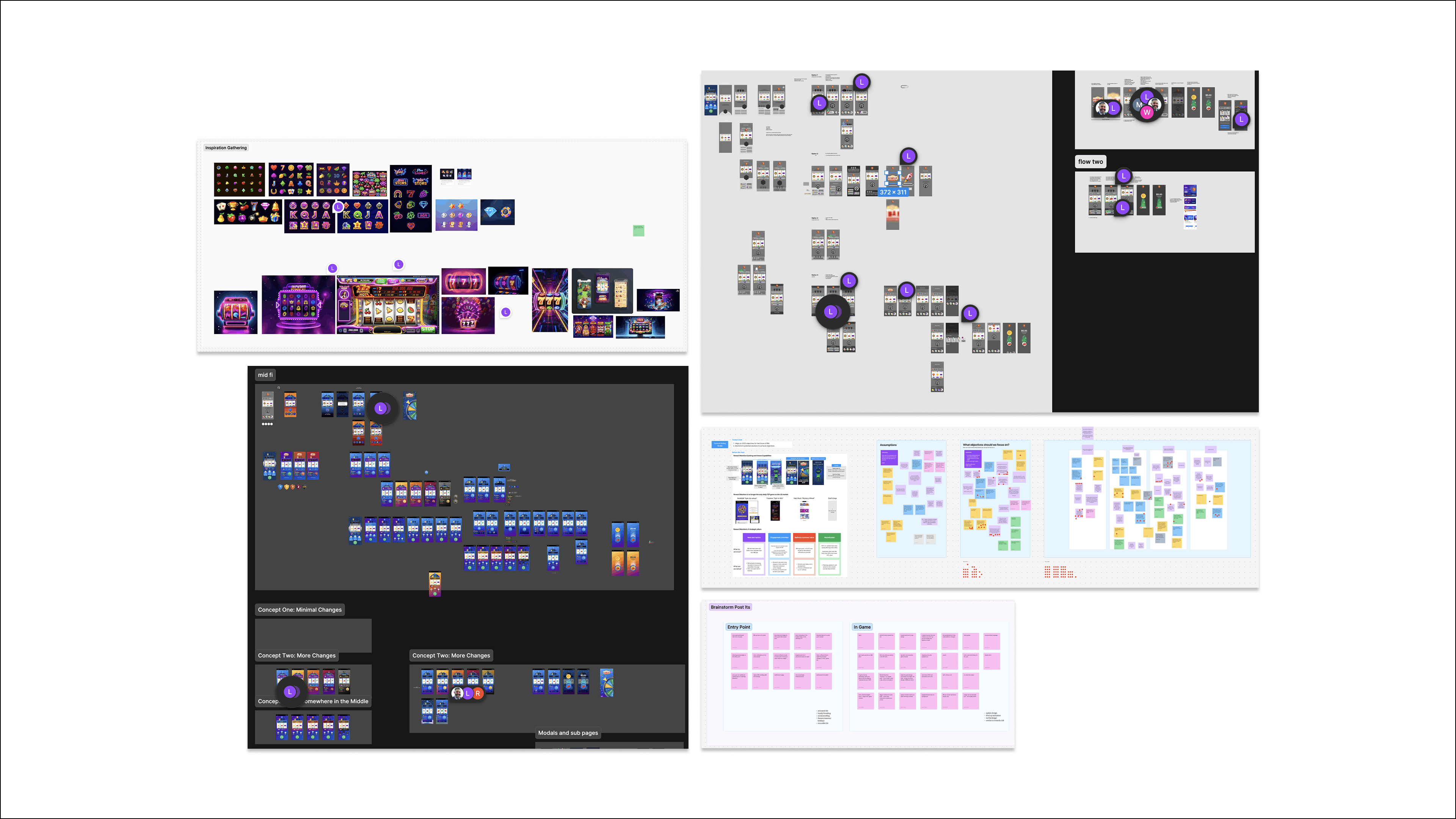
Analytics showed that Reward Machine was already a high-frequency interaction, while customer feedback revealed that players understood the core mechanic but lacked a clear sense of collection progress and what they were working toward.
This created an opportunity beyond simply driving more engagement: connect an existing player behavior to progression and loyalty.
I partnered with Product, Engineering, and Creative to translate these findings into the redesign strategy, turning Reward Machine from a standalone interaction into a more personalized extension of Rewards Club.
Evidence → Players were already engaging
Insight → Progression wasn't as visible or meaningful as it could be
Decision → Connect Reward Machine to loyalty, progression, and collection
Designing Reward Machine as a Loyalty Experience
The design challenge was to make Reward Machine feel like an integrated part of Rewards Club—not a standalone game. I focused on decisions that connected loyalty, information, interaction, and motion while keeping the experience familiar and easy to use.
01 — Connect a high-frequency interaction to loyalty
Rather than treating Reward Machine as a standalone game, I designed it as an extension of the Rewards Club ecosystem.
The experience became tier-aware, adapting to each player's loyalty level and reinforcing the relationship between play → progress → rewards.
This shaped the overall visual and interaction system. The player's loyalty tier became visible throughout the experience through the background, badge, spin button, and other interaction states.
The goal was simple: make players feel that their activity was contributing to something bigger than the individual interaction.
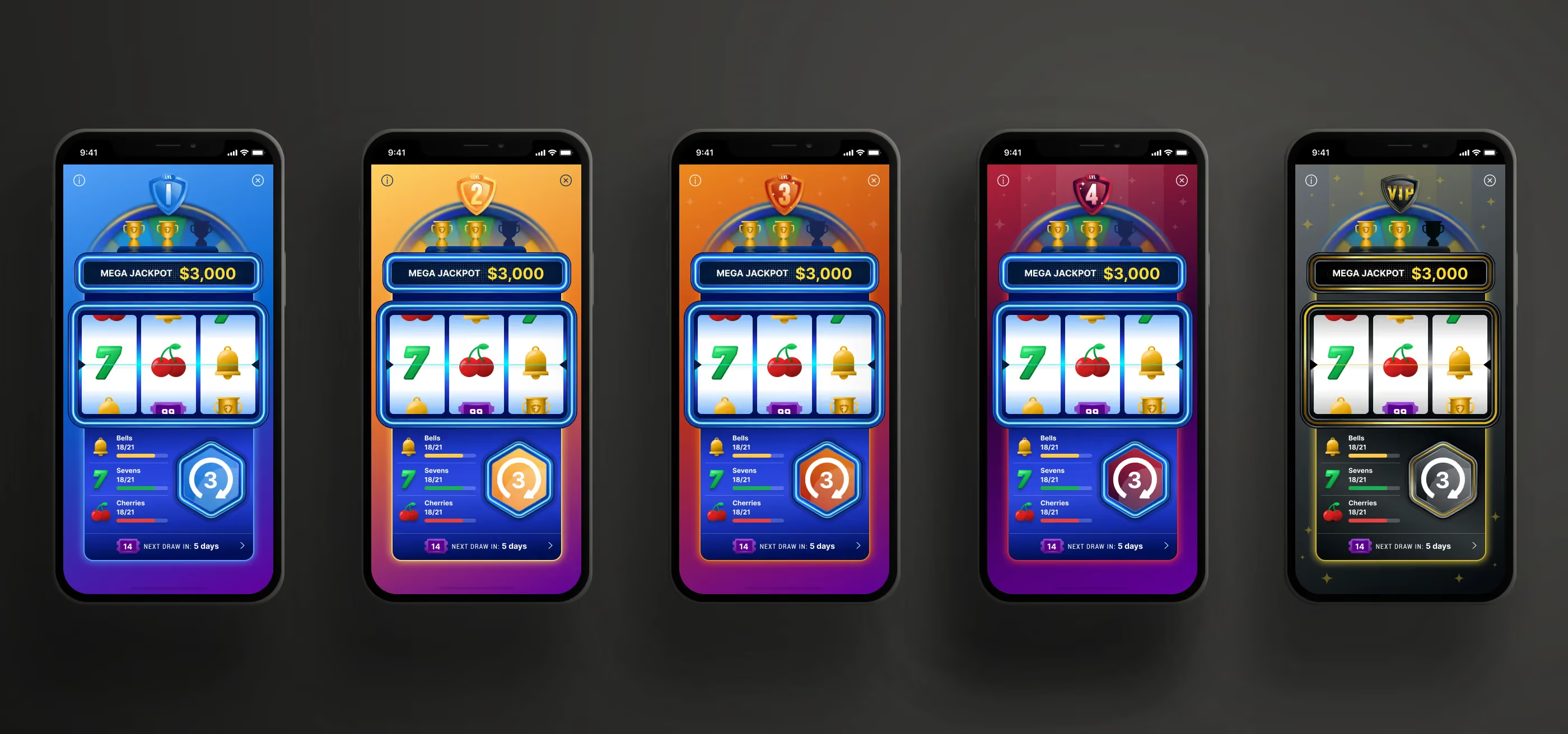
Crafting the tier system
I created a modular visual language that allowed each loyalty level to feel distinct while maintaining a consistent underlying experience.
- Backgrounds evolved across loyalty tiers.
- Tier badges provided an immediate indicator of status.
- Spin buttons adapted their visual treatment to reinforce progression.
- Interaction states changed with the player's level.
- The VIP experience introduced a more premium visual treatment, including a black mechanic and visual alignment with the VIP badge.
The system created differentiation without requiring an entirely different experience for every tier.
02 — Make progression visible
Through exploration and research, we identified an opportunity around collection progress. Players understood the core Reward Machine mechanic, but there was less clarity around what they had collected and how close they were to completion.
I focused on making that progress easier to understand without adding unnecessary complexity.
The collection experience was redesigned around clear progress indicators, helping players quickly understand:
What I've collected → What's left → How close I am
This turned progression into a visible feedback loop and gave players another reason to continue engaging.
Collection tracking
I simplified the collection experience using:
- Progress bars
- Clear collection states
- Improved hierarchy
- More visible completion feedback
- Simplified supporting information
Rather than relying on users to interpret multiple pieces of information, the design surfaced progress directly within the experience.
The principle: If progression is meant to motivate behavior, users need to be able to see it.
03 — Make the experience feel tactile and rewarding
Once the product strategy was established, I used interaction and motion to make the core mechanic feel more responsive and rewarding.
The goal wasn't to add animation for visual impact. Motion became part of the feedback system, reinforcing interaction, anticipation, and reward.
Interaction Design
The spin button became one of the primary moments of tactile feedback.
I designed the interaction to feel responsive and physical through changes in:
- Scale
- Energy
- Motion
- State
- Feedback timing
The interaction responds to the player's action, creating a stronger sense of cause and effect.
Motion System
I developed motion around a consistent visual language:
- Shimmer created energy and anticipation.
- Trim-path animations reinforced movement and progression.
- Responsive icon movement provided interaction feedback.
- Camera shake amplified high-energy moments.
- Transitions helped maintain continuity between states.
Motion was intentionally tied to the player's actions and the outcome of the experience rather than functioning as decoration.
04 — Build a scalable visual system
The experience needed to support more than the initial launch.
It had to work across loyalty tiers while leaving room for future campaigns, seasonal moments, and new content.
I designed the visual language as a modular system, rather than a collection of individual screens.
A system built to evolve
The system included:
- Tier-based backgrounds
- Modular iconography
- Loyalty badges
- Dynamic spin-button states
- Collection progress components
- Reel treatments
- Supporting data displays
- Reusable motion behaviors
This allowed the experience to evolve while maintaining a consistent interaction model.
The same foundation could support tentpole moments such as the Super Bowl, holidays, and new game releases without requiring the entire experience to be redesigned.
05 — Simplify the supporting experience
The core interaction was only part of the experience. I also redesigned the supporting touchpoints around Reward Machine to make information easier to understand and keep the experience cohesive.
This included:
Jackpot & information display
I consolidated the Talkback and jackpot information into a clearer hierarchy so players could access important information without competing with the primary interaction.
Modals & supporting pages
I redesigned supporting modals and information pages to create more consistent layouts, hierarchy, and interaction patterns.
I also partnered on copy updates to make the information easier to understand and more aligned with the redesigned experience.
Consistent interaction patterns
Information, close actions, states, and transitions were standardized across the supporting experience so the product felt like one cohesive system rather than a collection of individual components.
06 — Design through technical constraints
Reward Machine was built in partnership with an external engineering team, which introduced technical constraints around implementation and animation.
I worked closely with engineering throughout the process to understand what was feasible, communicate interaction and motion requirements, and make tradeoffs without losing the intent behind the experience.
I led the design handoff and build reviews, helping resolve issues around:
- Animation behavior
- Interaction states
- Responsive feedback
- Visual fidelity
- Tier-specific experiences
- Technical implementation
Rather than treating engineering constraints as something that happened at the end of the process, I incorporated them into the design process from the beginning.
The goal was to protect the experience while finding solutions that could actually ship.
07 — Validate across loyalty tiers
Before launch, I led UAT across the different Rewards Club tiers to make sure the experience behaved and looked as intended across the system.
I validated:
- Tier-specific visual states
- Progression behavior
- Collection states
- Interaction feedback
- Motion
- Edge cases
- Supporting information
- Consistency across tiers
This helped catch inconsistencies and implementation issues before the experience reached a larger audience.
.png)
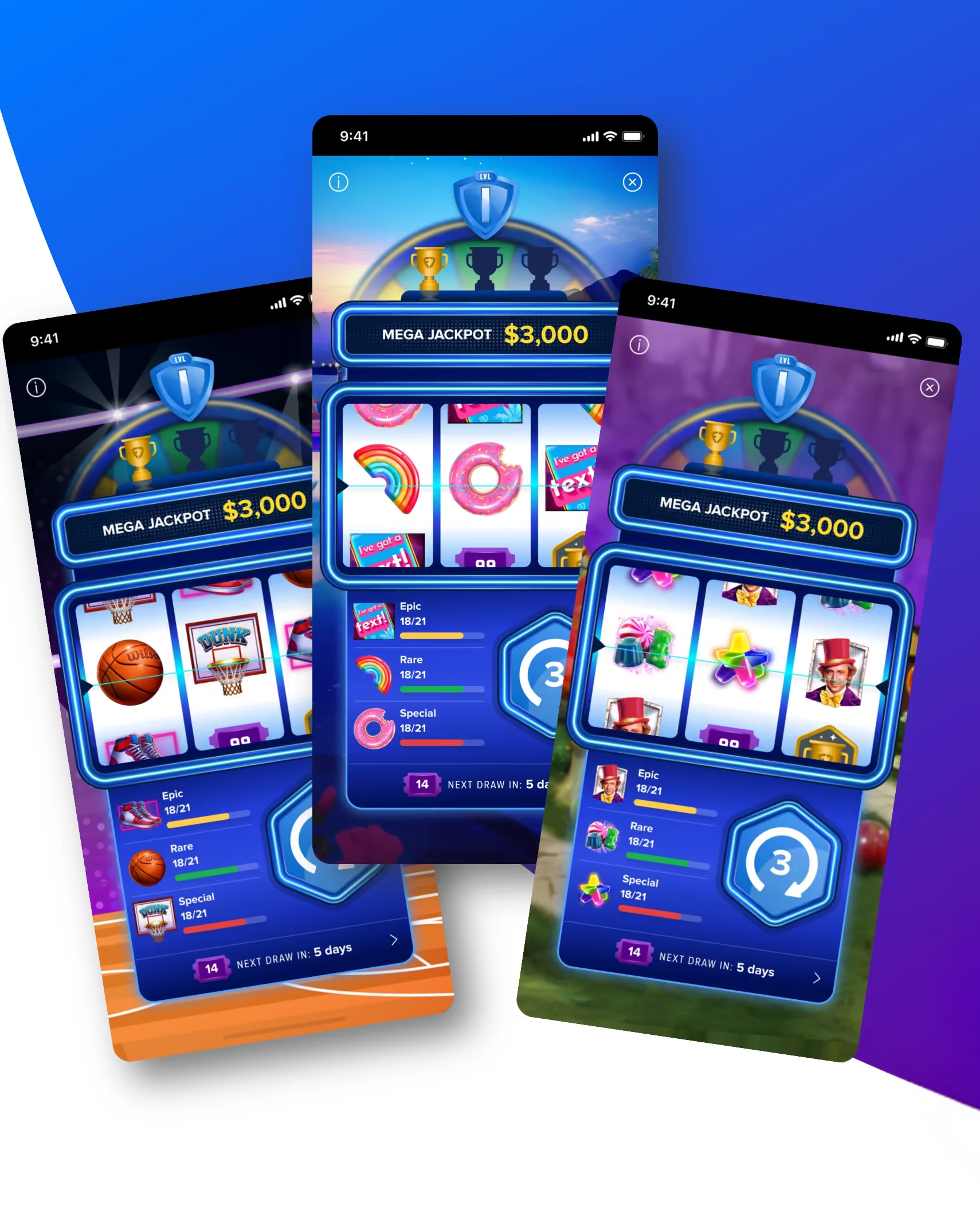
Designing for Every Loyalty Level
The team wanted the Reward Machine to feel personal to every player, rather than like a one-size-fits-all experience. I made the design decisions around how each loyalty tier could be visually represented while staying consistent with the established Rewards Club design system.
I defined how the background, badge, and spin button would adapt to each player’s tier, creating a stronger connection between their loyalty status and the reward moment. For VIP, I pushed the visual distinction further by turning the machine mechanic black to communicate a more premium experience and align with the existing VIP badge iconography.
These decisions helped turn loyalty from a label into a visible, tangible part of the Reward Machine experience.
.png)
Designing for Scale
The Reward Machine needed to work beyond a single launch; it had to become a flexible system that could evolve with the casino experience. The team needed a scalable foundation for tentpole moments like the Super Bowl, holidays and new game releases, without reinventing the experience each time.
I treated this as an opportunity within the constraint that shaped my design decisions from the start. I approached the iconography, bar graph data visualization, and background system as modular elements within a larger ecosystem, rather than designing for a single moment. This allowed the experience to be easily reskinned while maintaining a consistent product foundation.
The result was a Reward Machine designed not just for today’s experience, but for what comes next.
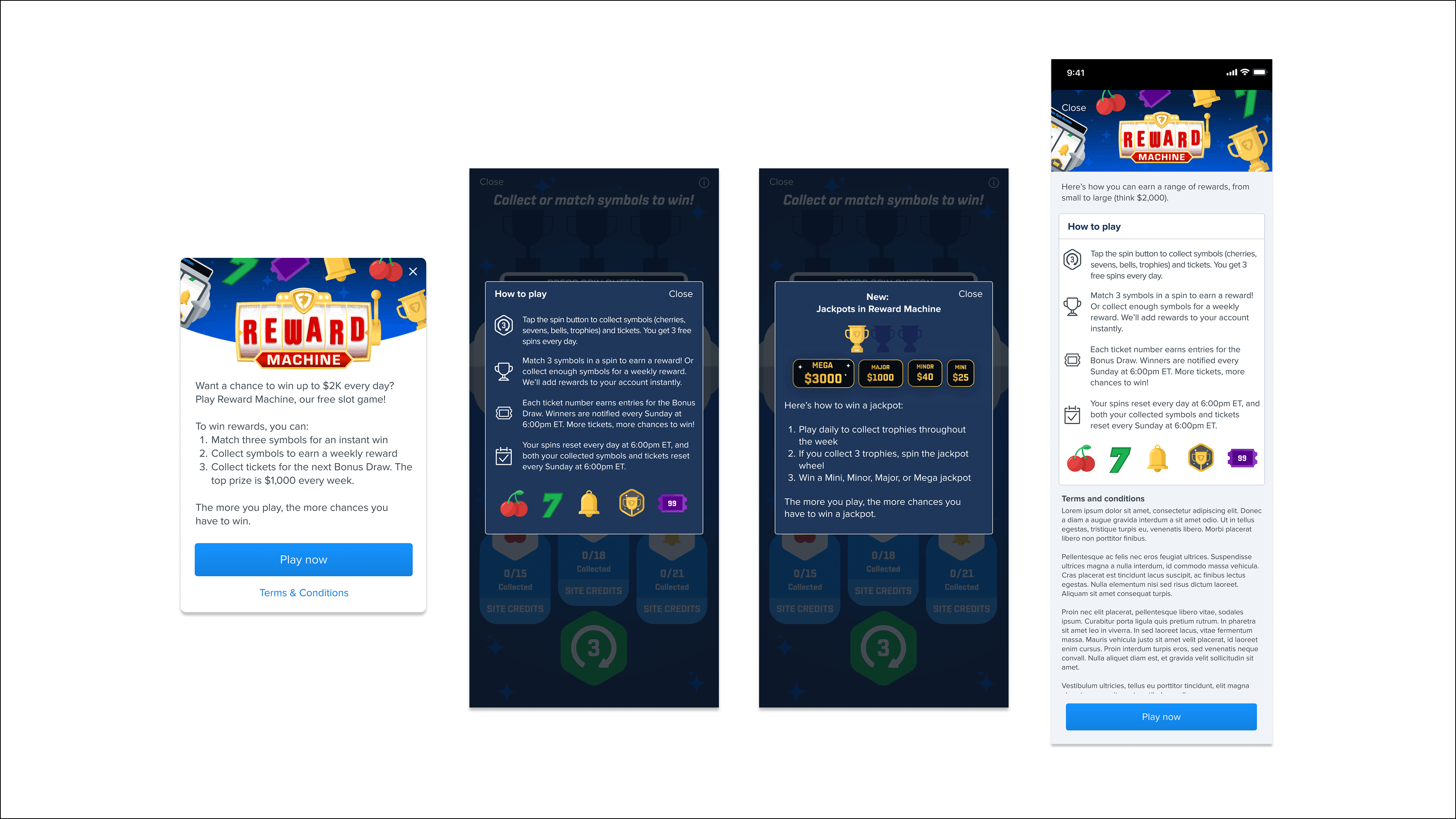
Bringing the New Experience Together
A refreshed experience needed more than a new core interaction—it needed every supporting touchpoint to feel intentional and connected. I redesigned the modals and information pages to carry the new visual aesthetic across the experience, while partnering on copy updates to make the information clearer and easier to understand.
This helped create a more cohesive end-to-end experience, ensuring that everything from gameplay to guidance felt like part of the same redesigned Reward Machine.
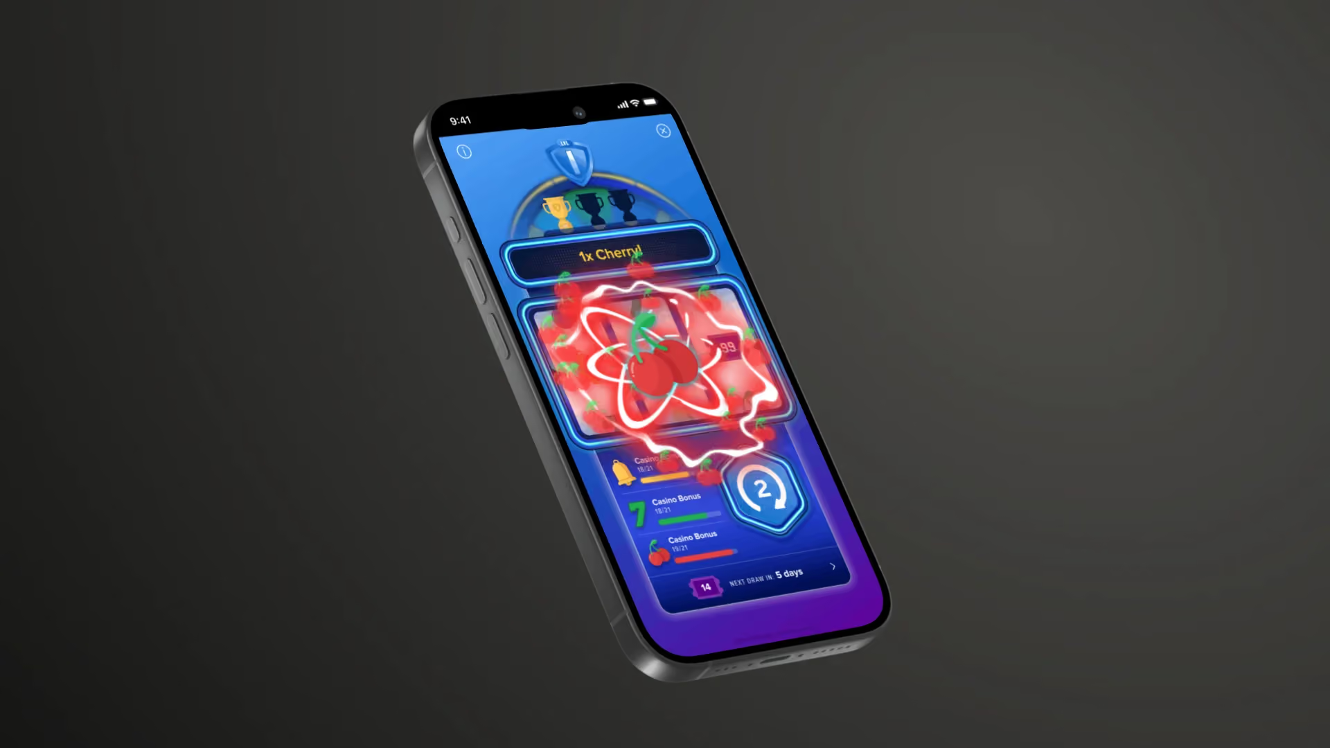
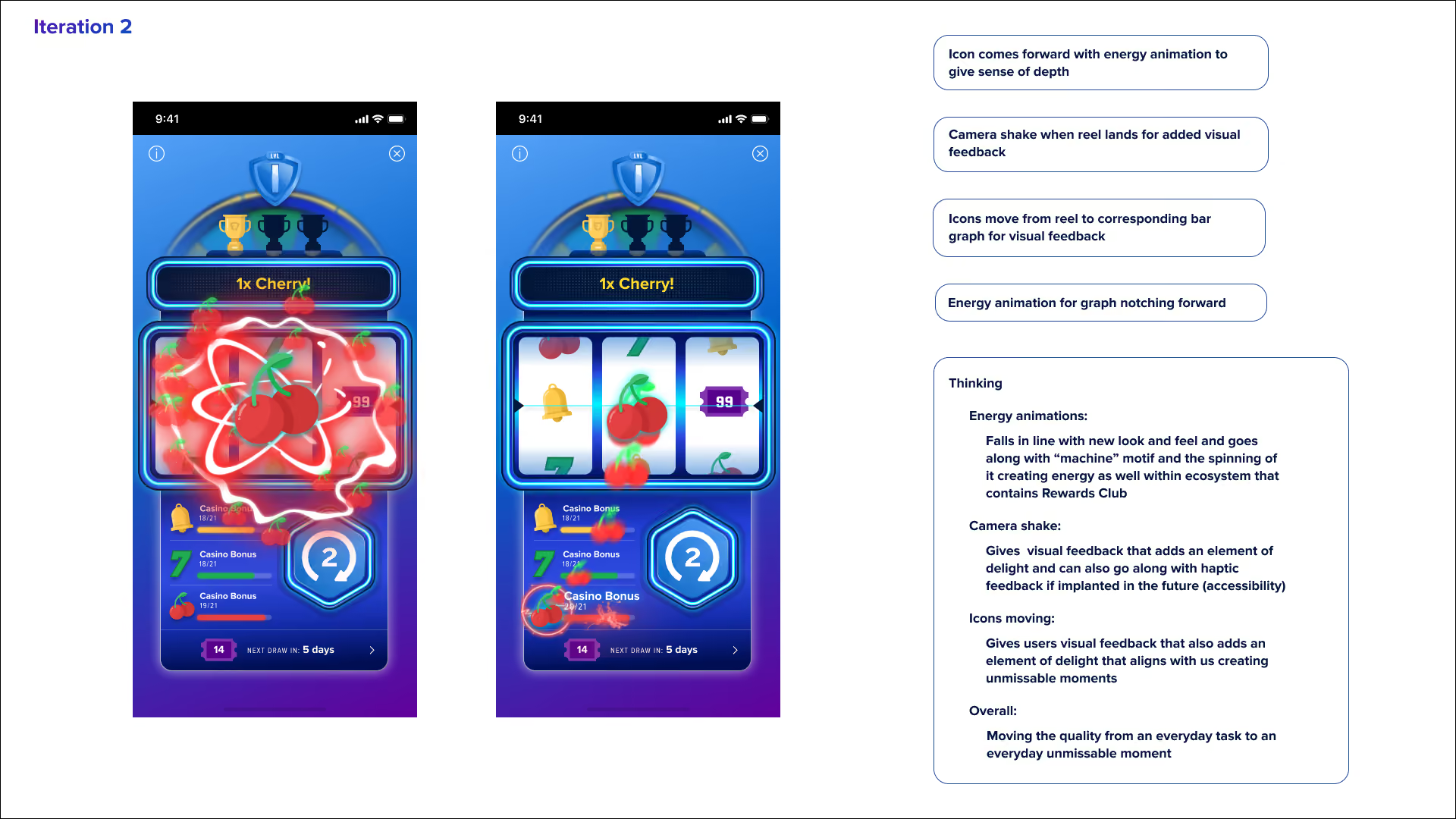
Scalable Animations
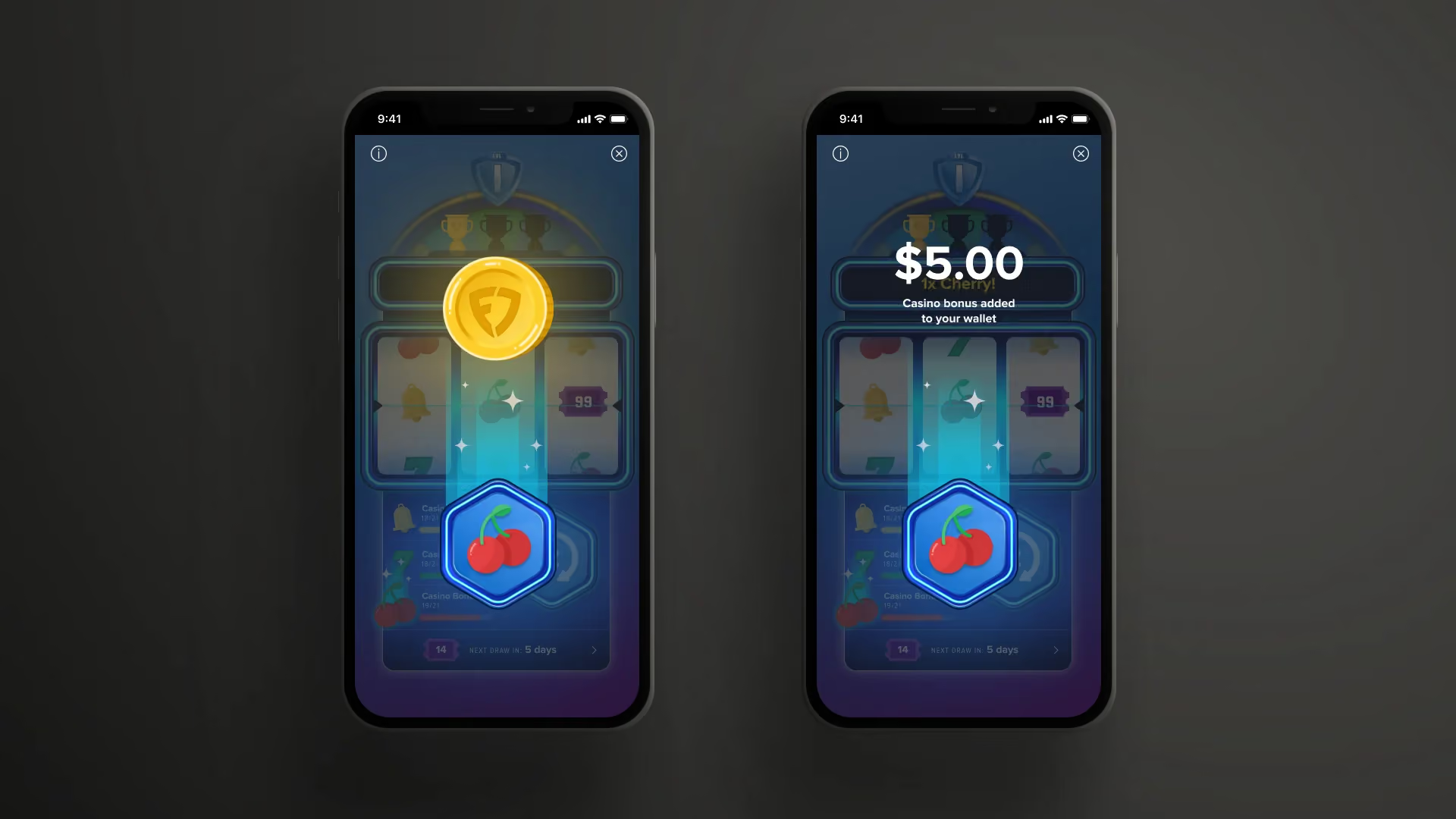
I evolved the motion of the experience from purely functional to expressive, transforming a routine interaction into an unmissable moment while ensuring it scales for future tentpole experiences.
- Shimmer animations built continuity with existing RM static animations, reinforcing brand consistency while elevating perceived quality.
- Trim path animations leveraged the neon design language and aligned with the broader Rewards Club motion ecosystem, ensuring cohesion across surfaces.
- Energy animations supported the new “machine” motif, using rotational movement to visually communicate momentum and reward activation.
- Camera shake and responsive icon movement introduced tactile visual feedback—adding delight today, with the opportunity to integrate haptics in the future for enhanced accessibility and multi-sensory feedback.
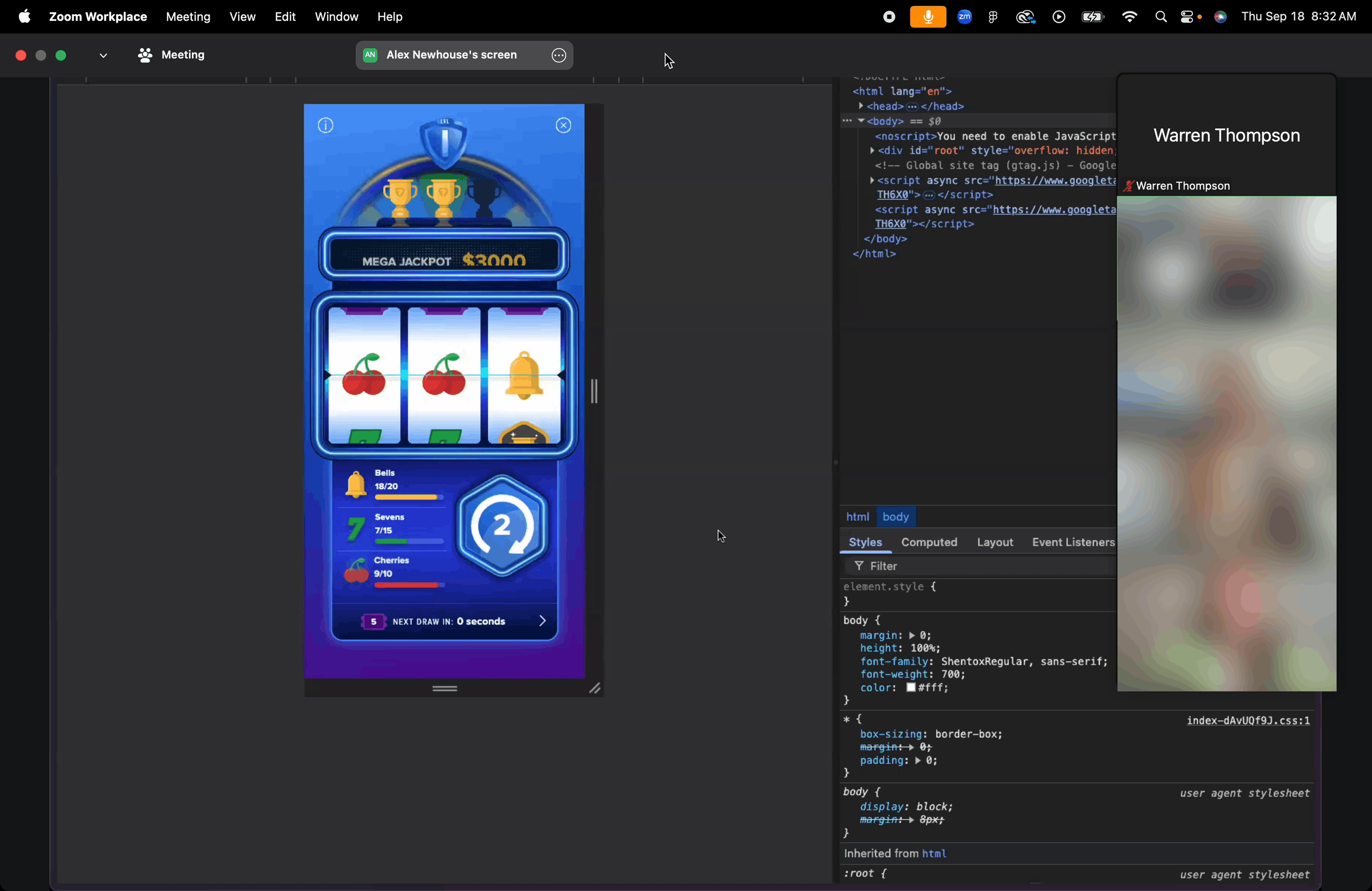
Designing Within Constraints
The Reward Machine runs on an external platform, supported by an outside engineering team responsible for bringing the experience into the app. This introduced a unique implementation constraint: how do we preserve the quality and intention of the design beyond the prototype?
I led the handoff of the designs and animations, working closely with the engineering team throughout implementation. Through frequent communication, feedback, and iteration, we resolved technical tradeoffs while protecting the key interaction and motion details that made the experience feel polished.
The result was an implementation that stayed true to the design vision and the quality established in our prototypes, despite the constraints of an external platform and team.
.png)
In Action
In product UAT of all tiered levels.
The Result
Reward Machine was initially soft-launched to 50% of users in Michigan and New Jersey to validate the experience before expanding further.
The results were significant:
+50%
Increase in active player betting days
90%
Of users returned week-to-week
50%
Initial user population used for the soft launch
The results led to a full rollout across FanDuel Casino users in the U.S.
A few months after launch, Reward Machine was also featured in a FanDuel commercial, extending the product experience into the broader brand and marketing ecosystem.
Impact
Reward Machine demonstrated how an existing high-frequency interaction could become a stronger product experience by connecting engagement, progression, and loyalty.
More importantly, it established a scalable foundation for future experiences rather than solving only the needs of the initial launch.
The opportunity wasn't simply to make Reward Machine look better. It was to make an existing behavior more meaningful—connecting what players do with where they're going.
Marketing
The project was an immediate success and the experience was featured in a marketing commercial a few months after release.
The Reward Machine game was soft-launched in Michigan and New Jersey to 50% of users, allowing us to measure its impact effectively. The results showed a significant increase in active player betting days, leading to a full rollout across all FanDuel Casino users in America. As of recently, 90% of users come back to the game week to week and there has been an uptick of +50% increase in active player betting days.